Color Rendering & Temperature
Color Rendering & Temperature
Two important characteristics of light involve it's Color Rendering Index and Color Temperature.
Color Temperature
Color temperature relates to the hue (color shade) of the light that we see. It's described by the terms "warm" and "cool". Warm light gives off a yellowish cast whereas cool lighting has a bluish tint.
Color temperature is measured in degrees Kelvin, with warmer colors having a lower number than cool colors (yes, it's counterintuitive). For example, candlelight is about 1800 degrees Kelvin whereas noon-time sunlight has a color temperature of about 5500 degrees Kelvin. By the way, the term "temperature" has nothing to do with the perceived physical temperature of the light source. Rather, it's derived from the scientific method used to designate the various color shades within the spectrum.
The important point with regard to color temperature is that it describes the color shade, however subtle, of the light emanating from a lamp (light source). Lamps (bulbs) with lower color temperatures will have a warmer tone than lights with higher color temperatures.
Color Rendering Index (CRI)
The CRI is a measurement scale that indicates a light's ability to render the trueness of colors, as they would appear in natural sunlight. The scale runs from 0 to 100, with 100 being the best.
Use lamps (remember, we're talking about "light bulbs" here) that have a CRI of 80 or greater for the best representation of colors. Incandescent and halogen lamps typically have the best or a very high CRI. Fluorescents will vary but all Energy Star rated compact fluorescent lamps will have a CRI of 80 or better.
One distinction to remember in all this is that color rendering will influence how you see the colors in your home and is independent of a light source's color temperature. If the CRI is poor, the colors of the objects in room won't be true.
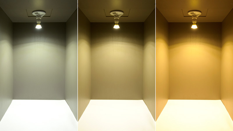
The three pictures below are a representation of the effects of color rendering and how the colors you see would be perceived under lighting with different color rendering capabilities. The photo on the left shows how the colors take on a bluish tint. The center photo shows the countertop and wall with a green tint. The photo on the right displays more natural colors.
One example of how this might play out is in the differences you see in carpet samples or paint swatches you take home with you from a showroom. Differences in lighting (relative to its CRI) between the showroom and your home can skew how the colors actually look between the two locations. That's why it's always a good idea to view samples in the kind of lighting they'll actually reside in.
www.liteharborfactory.com
info@liteharbor.com
 RESOURCE